Computation Boot Camp
Day 1 Solutions
Patrick Cahan
Assignment
- Use facets to plot distributions of teaching scores, one plot per year
- Scatter plot to explore relationship between the teaching score and the income (facet by year)
- Add a regression line to the above plot
- Same as 2 and 3 but exploring the relationship between total_score and income
- Same as 2 and 3 but exploring relationship between world_rank and research
- Does there appear to be an effect of female_male_ratio and total_score? Use boxplot to visualize
Load and clean the data
require(devtools)
library(slidify)
library(ggplot2)

tdat<-read.csv("../../misc/timesData.csv", header=1)
cclasses<-rep("numeric", ncol(tdat))
cclasses[c(1, 2,3, 10,12, 13)]<-"character"
tdat<-read.csv("../../misc/timesData.csv", header=1, colClass=cclasses, na.strings="-")
# na.strings defines what should be treated as NA
Load and clean the data Part II
Fix World Rank
wor<-tdat$world_rank
table(wor[grep("-", wor)])[1:2]
##
## 201-225 201-250
##     103      53
Fix World Rank
newWOR<-rep(0, length(wor));
badWOR<-names(table(wor[grep("-", wor)]))
indexBad<-vector();
for(bbad in badWOR){
  xi<-which(wor==bbad);
  indexBad<-append(indexBad, xi);
  valPair<-as.numeric(strsplit(bbad, "-")[[1]]);
  newChar<-mean(valPair);
  newWOR[xi]<-newChar;
}
goodInd<-setdiff(1:length(wor), indexBad);
newWOR[goodInd]<-as.numeric(wor[goodInd]);

tdat$world_rank<-newWOR
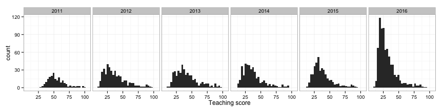
Problem 1: Use facets to plot distributions of teaching scores, one plot per year
plot1 <- ggplot(tdat, aes(x=teaching)) + geom_histogram() + facet_grid( .~ year) + theme_bw()
plot1 + xlab("Teaching score")
Problem 2-3: Scatter plot to explore relationship between the teaching score and the income (facet by year), add regression lines
plot2<-ggplot(tdat, aes(x=income, y=teaching)) + geom_point(colour="blue",alpha=0.15) +
geom_smooth(method=lm, colour='red') +
facet_grid( .~ year) +
theme_bw()
plot2 + ylab("Teaching score")
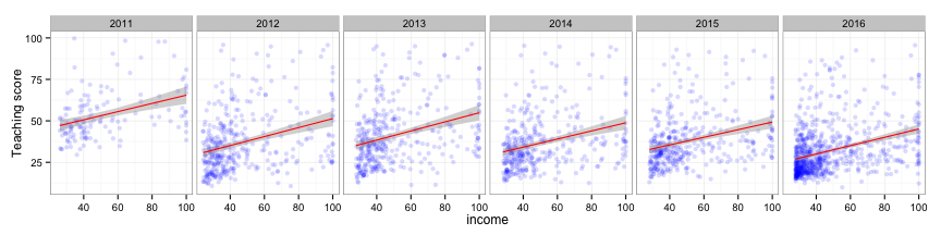
Problem 2-3: If you want to run stats on the associations:
summary(lm(teaching~income, data=subset(tdat, year==2011)))
##
## Call:
## lm(formula = teaching ~ income, data = subset(tdat, year == 2011))
##
## Residuals:
##     Min      1Q  Median      3Q     Max
## -27.066  -9.665  -2.810   6.263  50.445
##
## Coefficients:
##             Estimate Std. Error t value Pr(>|t|)
## (Intercept) 40.71592    2.81008  14.489  < 2e-16 ***
## income       0.24751    0.04954   4.996 1.73e-06 ***
## ---
## Signif. codes:  0 '***' 0.001 '**' 0.01 '*' 0.05 '.' 0.1 ' ' 1
##
## Residual standard error: 13.7 on 139 degrees of freedom
##   (59 observations deleted due to missingness)
## Multiple R-squared:  0.1522, Adjusted R-squared:  0.1461
## F-statistic: 24.96 on 1 and 139 DF,  p-value: 1.728e-06
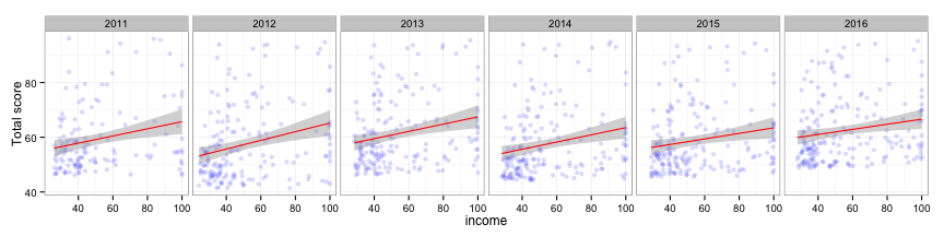
Problem 4: relationship between total_score and income
plot4<-ggplot(tdat, aes(x=income, y=total_score)) + geom_point(colour="blue",alpha=0.15) +
geom_smooth(method=lm, colour='red') +
facet_grid( .~ year) +
theme_bw()
plot4 + ylab("Total score")
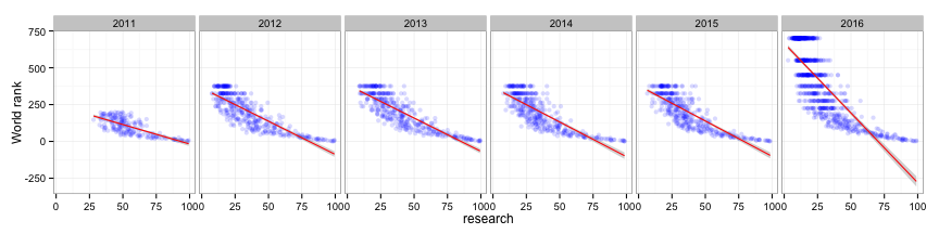
Problem 5: world_rank and research
plot5<-ggplot(tdat, aes(x=research, y=world_rank)) + geom_point(colour="blue",alpha=0.15) +
geom_smooth(method=lm, colour='red') +
facet_grid( .~ year) +
theme_bw()
plot5 + ylab("World rank")
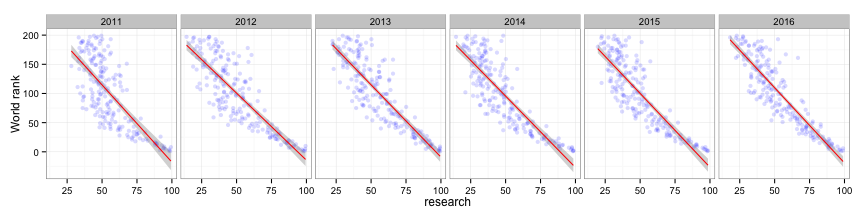
Problem 5: world_rank and research take II
thresh<-200
plot5v2<-ggplot(tdat[tdat$world_rank<thresh,], aes(x=research, y=world_rank)) + geom_point(colour="blue",alpha=0.15) +
geom_smooth(method=lm, colour='red') +
facet_grid( .~ year) +
theme_bw()
plot5v2 + ylab("World rank")
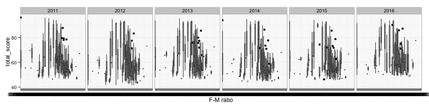
Problem 6: female_male_ratio and total_score?
plot6<-ggplot(tdat, aes(x=female_male_ratio, y=total_score)) +
geom_boxplot() +
facet_grid( .~ year) +
theme_bw()
plot6 + xlab("F-M ratio")